intros
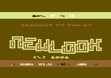
 Newlook 03
|

|
Visionary design in earth colors.
Really good!!!
|

|
Yep, but I like when designers show some bravery and use unusual colour combinations. Background black is so boring.
|

|
Agreed - this is a brilliant looking intro. The colorchoice is so-so, but very typical for its time. Would probably have gone for white, cyan or gray, purple, dark gray.
|

|
Wow, never seen this before. Marvellous design. Choice of colours is brill. and the logo.... 10/10
|

|
Legends, but the choice of colors is a mess up.
|
|